Note: This document is for an older version of GRASS GIS that will be discontinued soon. You should upgrade, and read the current manual page.
NAME
d.explanation.plot - Draw a plot of multiple rasters to explain a raster operation for example a + b = cKEYWORDS
display, manual, rasterSYNOPSIS
Flags:
- --help
- Print usage summary
- --verbose
- Verbose module output
- --quiet
- Quiet module output
- --ui
- Force launching GUI dialog
Parameters:
- a=name [required]
- Name of input raster map
- b=name
- Name of input raster map
- c=name
- Name of input raster map
- d=name
- Name of input raster map
- raster_font=string
- Font for raster numbers
- operator_ab=string
- Operator between a and b
- operator_bc=string
- Operator between b and c
- operator_cd=string
- Operator between c and d
- operator_font=string
- Font for operators
- label_a=string
- Label above the raster
- label_b=string
- Label above the raster
- label_c=string
- Label above the raster
- label_d=string
- Label above the raster
- label_font=string
- Font for labels
- label_size=float
- Text size for labels
- bottom=float
- Offset from the bottom (percentage)
Table of contents
DESCRIPTION
d.explantion.plot creates a plot of rasters and their relations which can serve as an explanation of a raster operation performed by a module or function.Up to four rasters are supported. The default operators assume rasters to have the following relation:
a + b -> c
EXAMPLES
Example using generated data
In Bash:g.region n=99 s=0 e=99 w=0 rows=3 cols=3 r.mapcalc expression="a = rand(0., 5)" seed=1 r.mapcalc expression="b = rand(0., 5)" seed=2 r.mapcalc expression="c = rand(0., 5)" seed=3 r.series input=a,b,c output=d method=average
import grass.jupyter as gj
plot = gj.Map(use_region=True, width=700, height=700)
plot.d_background(color="white")
plot.run("d.explanation.plot", a="a", b="b", c="c", d="d", operator_font="FreeMono:Regular")
plot.show()
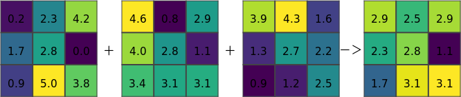
Figure: Resulting image for r.series
Example using artificial data
r.in.ascii input=- output=input_1 <<EOF
north: 103
south: 100
east: 103
west: 100
rows: 3
cols: 3
5 * 9
* 5 *
* 5 5
EOF
r.in.ascii input=- output=input_2 <<EOF
north: 103
south: 100
east: 103
west: 100
rows: 3
cols: 3
3 4 4
2 2 2
2 1 1
EOF
r.colors map=input_1,input_2 color=viridis
g.region raster=input_1
r.patch input=input_1,input_2 output=result
d.mon wx0 width=400 height=400 output=r_patch.png
d.explanation.plot a=input_1 b=input_2 c=result
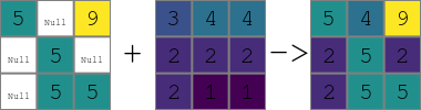
Figure: Resulting image for r.patch
KNOWN ISSUES
- Issue #3381 prevents d.rast.num to be used with d.mon cairo, so d.mon wx0 needs to be used with this module. Using environmental variables for rendering directly or using tools such as Map from grass.jupyter avoids the issues.
- Issue #3382 prevents usage of centered text with d.mon wx0, so the hardcoded values for text does not work perfectly.
- Issue #3383 prevents d.rast.num to be saved to the image with d.mon wx0, taking screenshot is necessary (with a powerful screenshot tool, this also addresses the copping issue below).
- The size of the display must be square to have rasters and their cells as squares, e.g., d.mon wx0 width=400 height=400 must be used. The image needs to be cropped afterwards, e.g. using ImageMagic's mogrify -trim image.png.
SEE ALSO
g.region, d.frame, d.rast.num, d.grid, d.mon, v.mkgridAUTHOR
Vaclav Petras, NCSU GeoForAll LabSOURCE CODE
Available at: d.explanation.plot source code (history)
Latest change: Tuesday Oct 04 23:05:29 2022 in commit: b4cfa50ee83494c188c024548a4ff4f0600dc551
Note: This document is for an older version of GRASS GIS that will be discontinued soon. You should upgrade, and read the current manual page.
Main index | Display index | Topics index | Keywords index | Graphical index | Full index
© 2003-2023 GRASS Development Team, GRASS GIS 8.2.2dev Reference Manual