Note: This document is for an older version of GRASS GIS that will be discontinued soon. You should upgrade, and read the current manual page.
NAME
r.scatterplot - Creates a scatter plot of raster mapsCreates a scatter plot of two or more raster maps as a vector map
KEYWORDS
raster, statistics, diagram, correlation, scatter plot, vectorSYNOPSIS
Flags:
- -w
- Place into the current region south-west corner
- The output coordinates will not represent the original values
- -f
- Automatically offset each scatter plot
- The output coordinates will not represent the original values
- -s
- Put points into a single layer
- Even with multiple rasters, put all points into a single layer
- -u
- Invert mask
- -b
- Do not build topology
- Advantageous when handling a large number of points
- --overwrite
- Allow output files to overwrite existing files
- --help
- Print usage summary
- --verbose
- Verbose module output
- --quiet
- Quiet module output
- --ui
- Force launching GUI dialog
Parameters:
- input=name[,name,...] [required]
- Name of input raster map(s)
- output=name [required]
- Name for output vector map
- z_raster=name
- Name of input raster map to define Z coordinates
- color_raster=name
- Name of input raster map to define category and color
- xscale=float
- Scale to apply to X axis
- Default: 1.0
- yscale=float
- Scale to apply to Y axis
- Default: 1.0
- zscale=float
- Scale to apply to Z axis
- Default: 1.0
- position=east,north
- Place to the given coordinates
- The output coordinates will not represent the original values
- spacing=float
- Spacing between scatter plots
- Applied when automatic offset is used
- vector_mask=name
- Areas to use in the scatter plots
- Name of vector map with areas from where the scatter plot should be generated
- mask_layer=string
- Layer number or name for vector mask
- Vector features can have category values in different layers. This number determines which layer to use. When used with direct OGR access this is the layer name.
- Default: 1
- mask_cats=range
- Category values for vector mask
- Example: 1,3,7-9,13
- mask_where=sql_query
- WHERE conditions for the vector mask
- Example: income < 1000 and population >= 10000
Table of contents
DESCRIPTION
The r.scatterplot module takes raster maps and creates a scatter plot which is a vector map and where individual points in the scatter plot are vector points. As with any scatter plot the X coordinates of the points represent values from the first raster map and the Y coordinates represent values from the second raster map. Consequently, the vector map is placed in the combined value space of the original raster maps and its geographic position should be ignored. Typically, it is necessary to zoom or to change computational in order to view the scatter plot or to perform further computations on the result.With the default settings, the r.scatterplot output allows measuring and querying of the values in the scatter plot. Settings such as xscale or position option change the coordinates and make some of the measurements wrong.
Multiple variables
If more than two raster maps are provided to the input option, r.scatterplot creates a scatter plot for each unique pair of input maps. For example, if A, B, C, and D are the inputs, r.scatterplot creates scatter plots for A and B, A and C, A and D, B and C, B and D, and finally C and D. Each pair is part of different vector map layer. r.scatterplot provides textual output which specifies the pairs and associated layers.A 3D scatter plot can be generated when the z_raster option is provided. A third variable is added to each scatter plot and each point has Z coordinate which represents this third variable.
Each point can also have a color based on an additional variable based on the values from color_raster. Values from a raster are stored as categories, i.e. floating point values are truncated to integers, and a color table based on the input raster color table is assigned to the vector map.
The z_raster and color_raster can be the same. This can help with understanding the 3D scatter plot and makes the third variable visible in 2D as well. When z_raster and color_raster are the same, total of four variables are associated with one point.
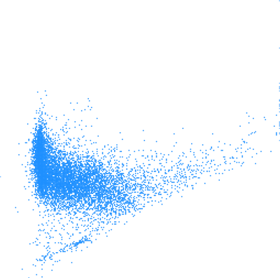
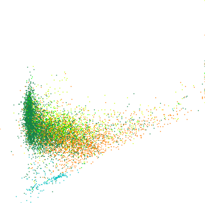
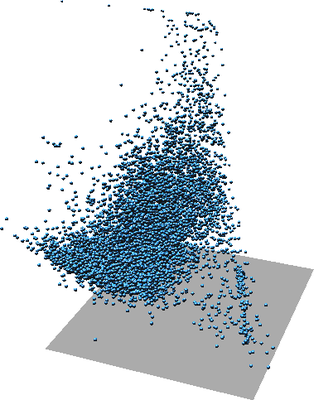
Figure: One scatter plot of two variables (left), the same scatter plot but with color showing third variable (middle), again the same scatter plot in 3D where Z represents a third variable (right).
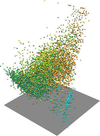
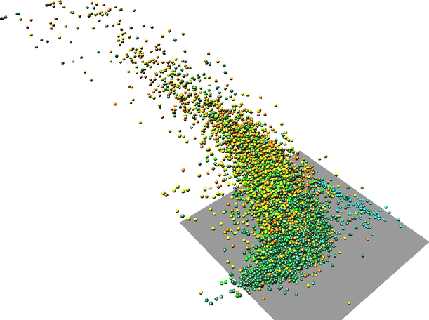
Figure: One scatter plot in with one variable as Z coordinate and another variable as color (two rotated views).
Layout
When working only with variable, X axis represents the first one and Y axis the second one. With more than one variable, the individual scatter plots for individual pairs of variables are at the same place. In this case, the coordinates show the actual values of the variables. Each scatter plot is placed into a separate layer of the output vector map.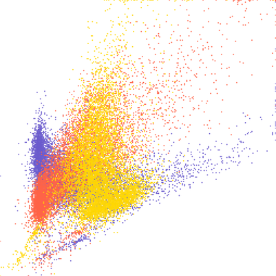
Figure: Three overlapping scatter plots of three variables A, B, and C. Individual scatter plots are distinguished by color. The colors can be obtained using d.vect layer=-1 -c.
If visualization is more important than preserving the actual values, the -s flag can be used. This will place the scatter plots next to each other separated by values provided using spacing option.
The layout options can be still combined with additional variables represented as Z coordinate or color. In that case, Z coordinate or color is same for all the scatter plots.
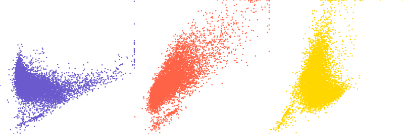
Figure: Three scatter plots of three variables A, B, and C. First one is A and B, second A and C, and third B and C.
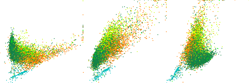
Figure: Three scatter plots of three variables A, B, and C with color showing a fourth variable D in all scatter plots.
NOTES
The resulting vector will have as many points as there is 3D raster cells in the current computational region. It might be appropriate to use coarser resolution for the scatter plot than for the other computations. However, note that the some values will be skipped which may lead, e.g. to missing some outliers.
The color_raster input is expected to be categorical raster or have values which won't loose anything when converted from floating point to integer. This is because vector categories are used to store the color_raster values and carry association with the color.
The visualization of the output vector map has potentially the same issue as visualization of any vector with many points. The points cover each other and above certain density of points, it is not possible to compare relative density in the scatter plot. Furthermore, if colors are associated with the points, the colors of points rendered last are those which are visible, not actually showing the prevailing color (value). The modules v.mkgrid and v.vect.stats can be used to overcome this issue.
EXAMPLES
Landsat bands
In the full North Carolina sample location, set the computation region to one of the raster maps:g.region raster=lsat7_2002_30
r.scatterplot input=lsat7_2002_30,lsat7_2002_40 output=scatterplot color_raster=landclass96
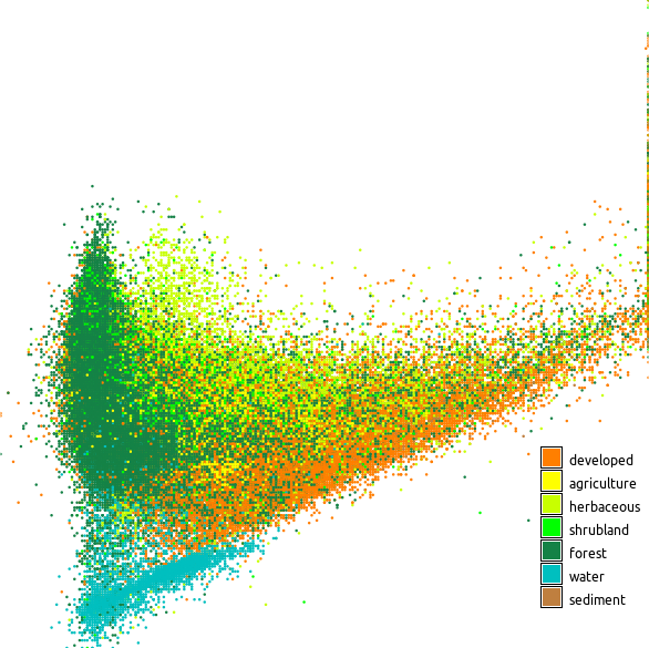
Figure: Scatter plot showing red and near infrared Landsat bands colored using land cover classes
High density scatter plots
In an ideal case, the scatter plot is computed with the computation region resolution set to the resolutions of one of the rasters (which ideally matches the other raster as well):g.region raster=lsat7_2002_30 -p r.scatterplot input=lsat7_2002_30,lsat7_2002_40 output=scatterplot_full_res
g.region raster=lsat7_2002_30 res=120 -p
r.scatterplot input=lsat7_2002_30,lsat7_2002_40 output=scatterplot_res_120
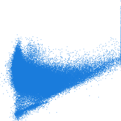
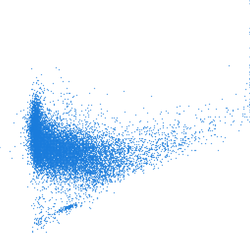
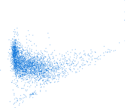
Figure: Scatter plots computed with different computational region resolutions; first one is with full raster resolution (~30 m) second with resolution 120 m, and third with 240 m
g.region raster=lsat7_2002_30 -p
r.scatterplot input=lsat7_2002_30,lsat7_2002_40 output=scatterplot
g.region vector=scatterplot res=5 -p
v.mkgrid map=scatterplot_grid
v.vect.stats points=scatterplot areas=scatterplot_grid count_column=count
v.colors map=scatterplot_grid use=attr column=count color=viridis
d.vect map=scatterplot_grid where="count > 0" icon=basic/point
v.mkgrid -h map=scatterplot_grid
g.region vector=scatterplot res=1 w=w-0.5 e=e+0.5 s=s-0.5 n=n+0.5
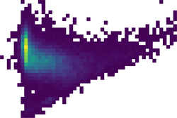
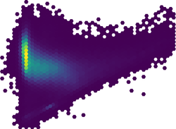
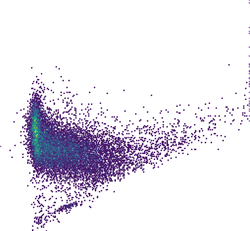
Figure: High density scatter plot visualized using binning into rectangular grid, hexagonal grid, and dense rectangular grid
SEE ALSO
r.stats, d.correlate, r3.scatterplot, v.mkgrid, v.vect.stats, g.regionAUTHOR
Vaclav Petras, NCSU GeoForAll LabSOURCE CODE
Available at: r.scatterplot source code (history)
Latest change: Monday Jan 30 19:49:11 2023 in commit: 5fb6b1a969e72db28df78483d3360b15a17f0c68
Note: This document is for an older version of GRASS GIS that will be discontinued soon. You should upgrade, and read the current manual page.
Main index | Raster index | Topics index | Keywords index | Graphical index | Full index
© 2003-2023 GRASS Development Team, GRASS GIS 8.2.2dev Reference Manual